Customize data grids
Toolpad Studio is built to allow extensibility as a first-class citizen.
Default behavior
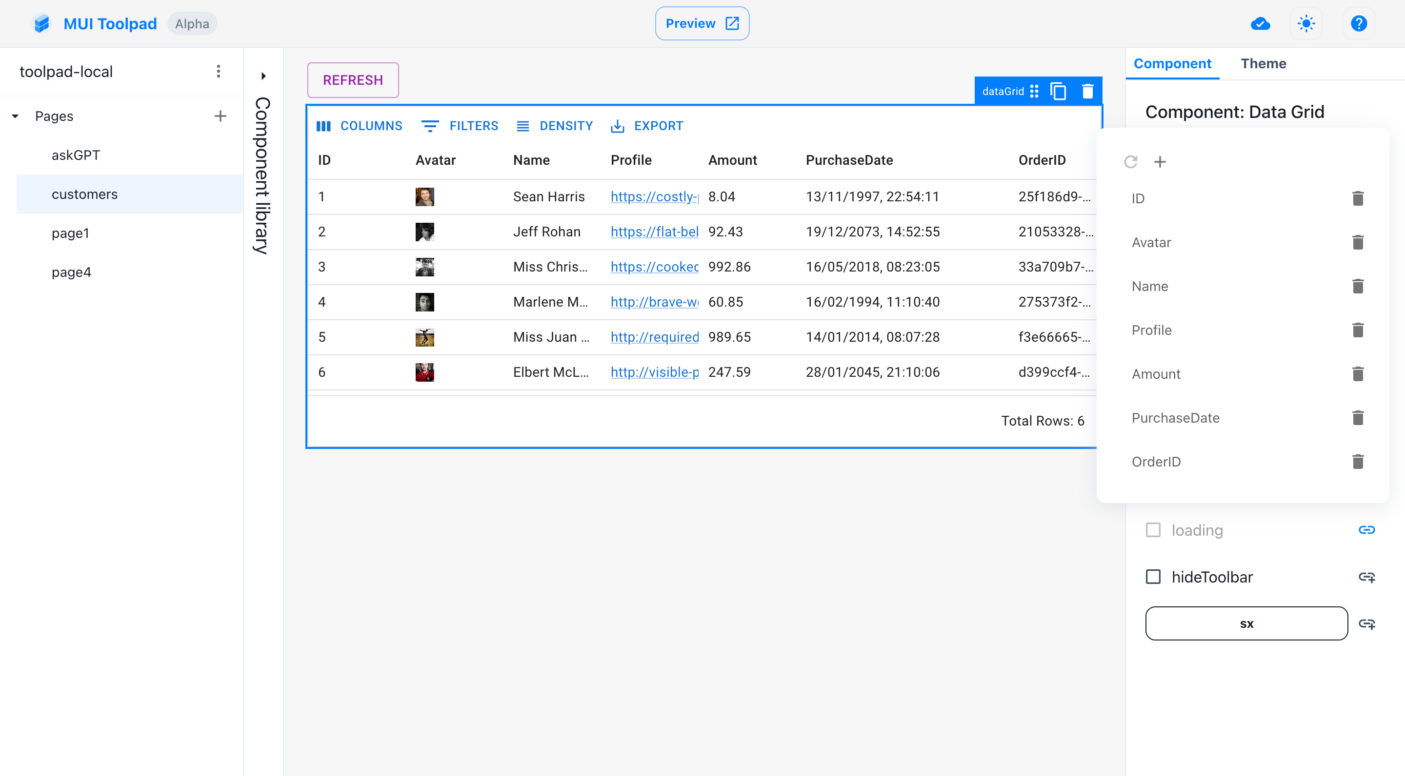
By default, you can connect any JSON data to a Toolpad Studio data grid and it will attempt to guess each column's type display it appropriately:

The default data grid showing multiple data types
Customizing cell rendering
However, if the default column options are not sufficient, Toolpad Studio allows you to customize your data grid with custom components, using the powerful features of the MUI X Data Grid.
Creating a custom component
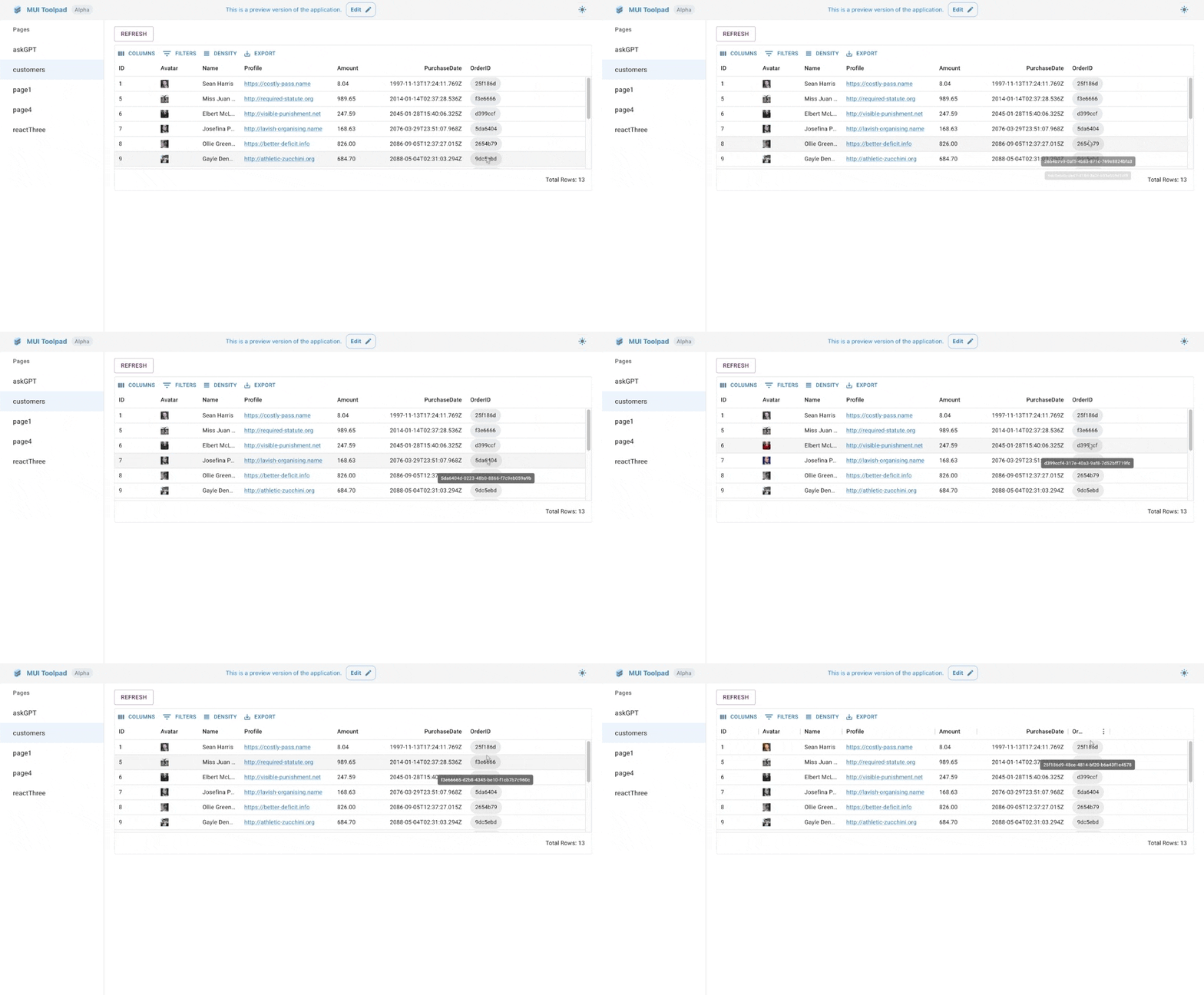
Suppose we want to display only the first eight characters of the Order ID in a <Chip>, and show the full text on hover, in a <Tooltip>.
We'll create a custom component to achieve this.
A custom component that renders inside the data grid receives a params object as a prop, containing the following values:
value: the value of the specific cellrow: the value of the entire rowfield: the name of the field for that specific column
Using the value prop, you can create a custom component like the following:
import * as React from 'react';
import Chip from '@mui/material/Chip';
import Tooltip from '@mui/material/Tooltip';
import { createComponent } from '@toolpad/studio/browser';

export interface OrderIdChipProps {
  value: string;
}

function OrderIdChip({ value }: OrderIdChipProps) {
  return (
    <Tooltip title={value}>
      <Chip label={value.slice(0, 7)} />
    </Tooltip>
  );
}

export default createComponent(OrderIdChip, {
  argTypes: {
    value: {
      type: 'string',
      default: '',
    },
  },
});
The OrderIdChip component should appear in our component library on saving:
Configuring custom components in the data grid
- Select the data grid and choose the columns property in the inspector:

The columns editor
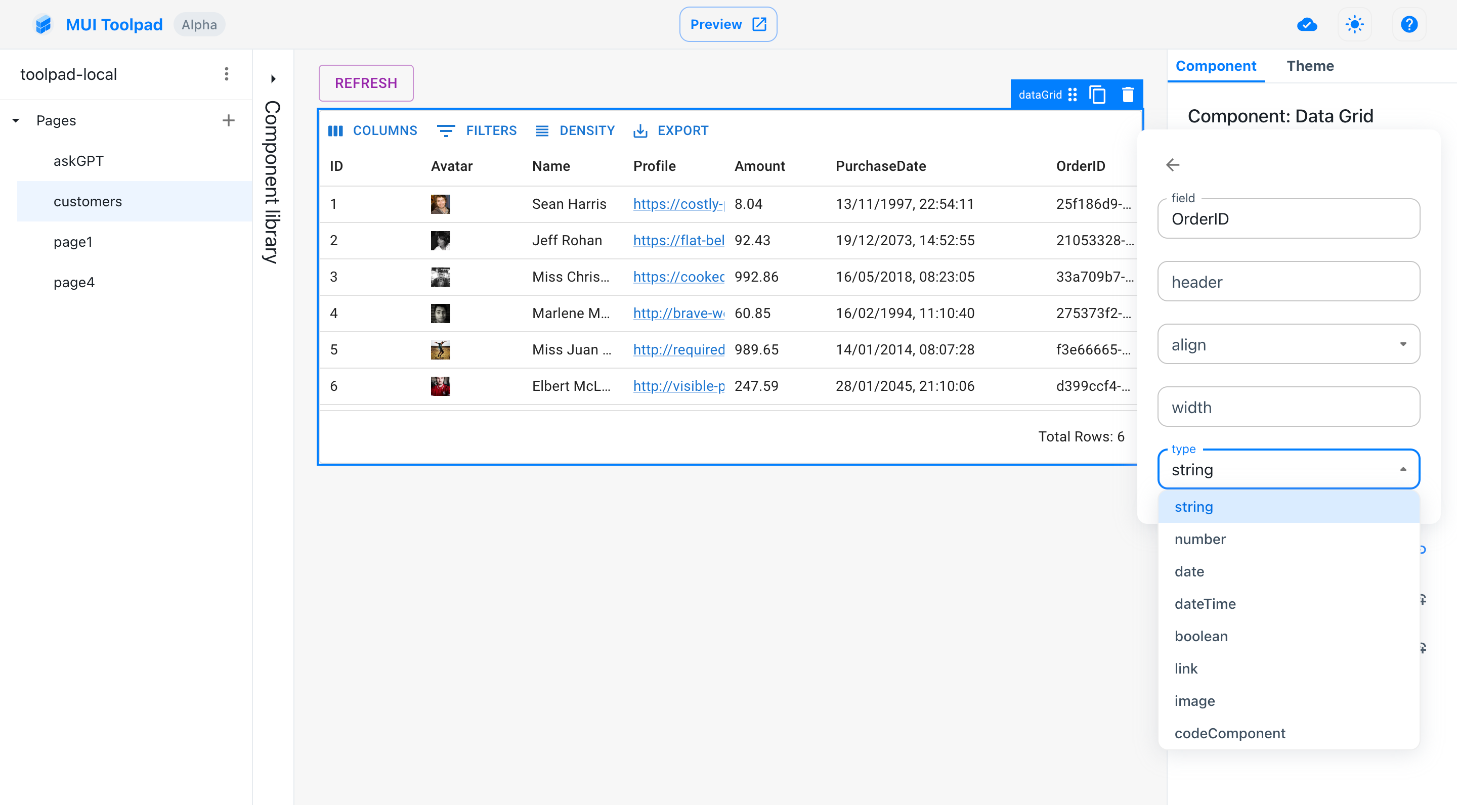
- Choose Order ID and change its type to be
codeComponent:

Setting the column type
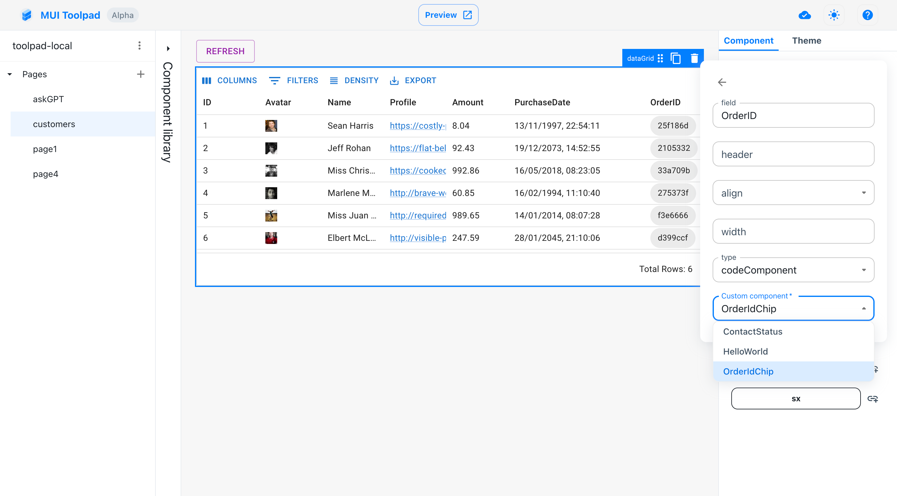
- Choose the
OrderIdChipcolumn in the select menu for custom component:

Choosing the custom component you created
- That's it! We have the desired functionality:

Using our custom component in the data grid