Theming
Toolpad Studio allows you to add your custom theme to your app, or customize individual component styles.
Adding a global theme
To change the application theme, go to the Theme tab in the inspector panel.
In the theme options you can:
- change your UI to light or dark mode.
- set primary and secondary colors for your UI, from a predefined list of colors.
The theme used in a project is configured by an auto-generated
theme.ymlfile inside thetoolpadfolder. The file schema documentation contains detailed information on the supported options.
Overrides
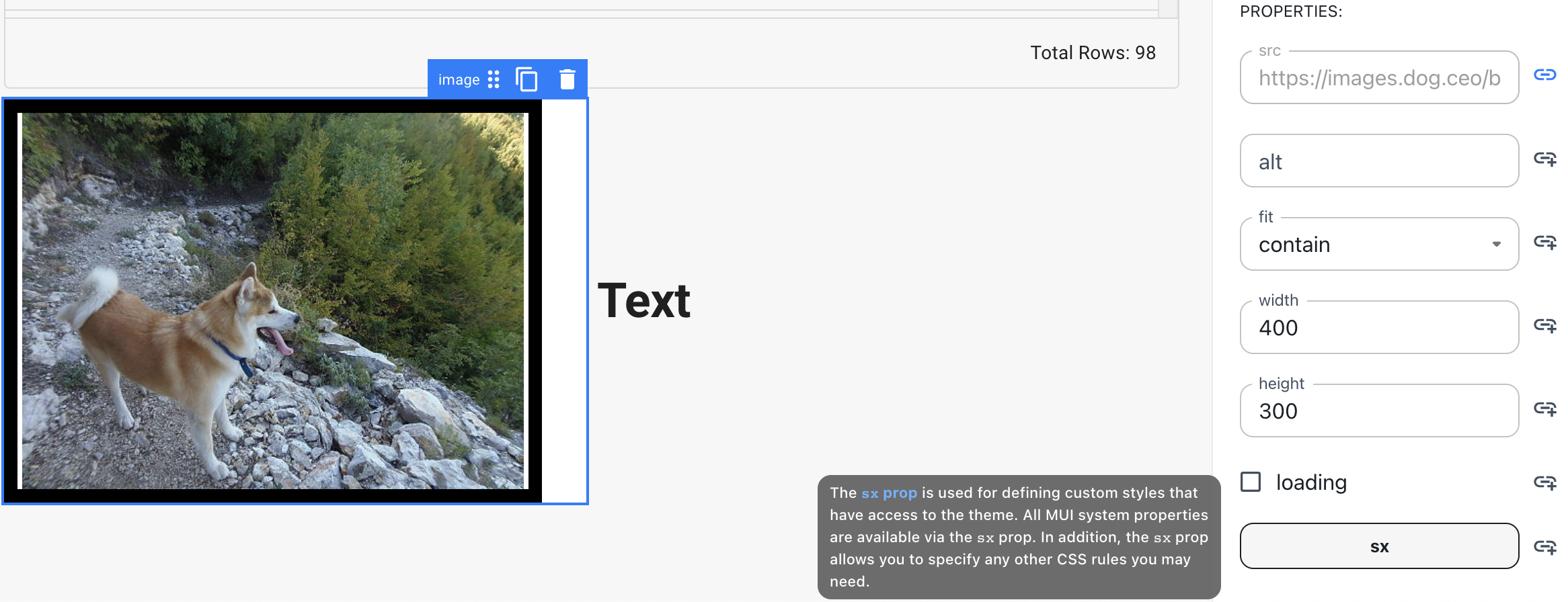
In order to provide a customised styling to the components used in your pages, you can use style overrides via the sx prop in the Inspector.

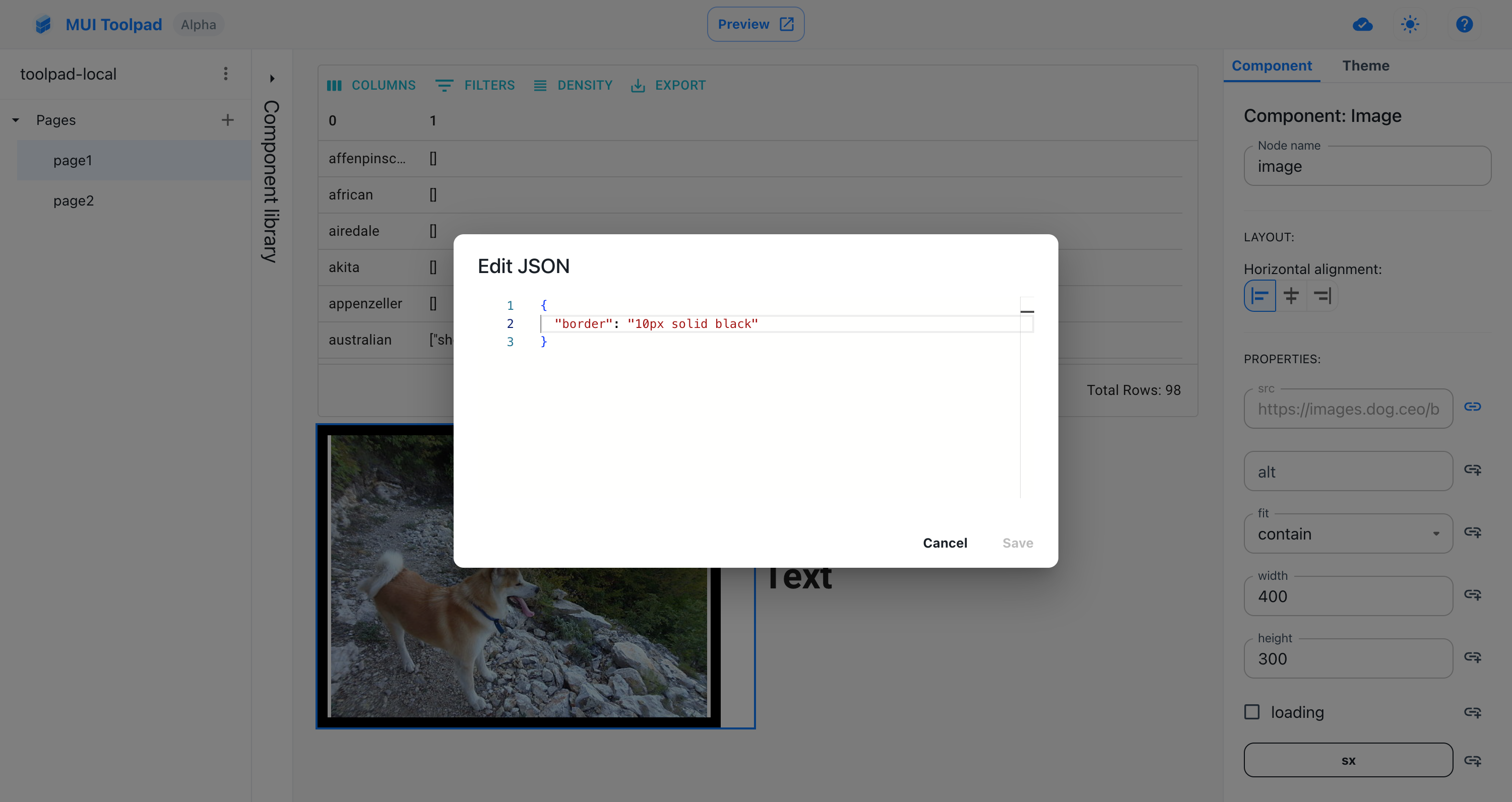
Adding custom styles via the sx prop
Once you click on the sx prop, add style overrides in the JSON editor. Any value that is accepted by the MUI System sx prop is acceptable here.

Styling the Image component